Along with the extracted text from the transcribed interviews, the edit/or team were given the task of producing a high-quality graphic, representing a Global Festival. As a team, we were given ten images and texts of festival practitioners, some of which were part of the keynote speakers.
The brief for the task was to incorporate all the data into two separate graphics. The first graphic would need to showcase where the different speakers were from around the world while the second graphic was to produce a creative collage of all the 10 images from the festival practitioners. As a co.lab team we found the brief for this task very unclear. The brief was produced by academics from the editorial team who had no design vision for the final output for both graphics.
Following a quick meeting, briefing us about the task, we decided to get together as a group and come up with different design options. Initially, this started with desktop research, looking at different precedent studies before working up sketch proposals.


Along with producing a completely new original design graphic we were aware that the designs would need to relate back to the idea of what makes a festival. One way of doing this was through the use of colour.
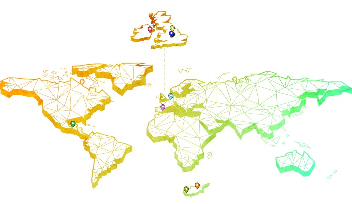
We decided on a colour palette consisting of ten different colours which would all relate to a festival theme. Each colour option would be assigned to the different festival practitioner’s text, images and their locations for the Global Map. Once we had produced an outline base map of the world, we decided that each country or region within countries should be represented by a triangular pattern inspired by the Architecture Festival & the City logo.
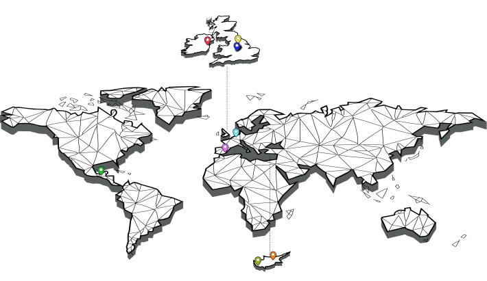
Figure 02
Thinking back to a previous conversation with Christian Frost in regard to the original Architecture Festival & the City website which was used for the Conference, Christian had explained to the group the design principles of the grey scale background image on the homepage. The image had a select use of primary colours in carefully consider areas to help visually represent the idea of a festival. This idea was something that we wanted to continue and incorporate into the design of the world map to give it a more vibrant feel.
Lewis Buckley
Edit/or – Editorial Team

You must be logged in to post a comment.