During our session last week (5th Feb), we had a meeting with Jeiling to talk about the ten images and the illustrations (Task 3). She briefed us on how to integrate the ten images, in a layout where images with contrasting themes are placed together, and vice versa. However we were not given an example or an idea of how the illustration should be like. We managed to get the location for all the images and the abstracts through Jemma before the end of the session.
The coming Friday, we met to discuss and work on the illustrations. We did some research to get inspiration including precedents of collages and photo montages. As a group, we were having difficulty in understanding the images, and how they represented the theme ‘festival’. They were also of poor quality, thus was difficult to work with. Reading the abstracts of the papers, helped us to get a better understanding of what the images symbolised. We traced over the key elements on the image that represented the theme of the papers. This was very helping in comparing and identifying similarities and differences between the themes of the images.
We tried to work on a draft illustration to get feedback on for our next session which is shown below in figure 2. This illustration has the key elements of each image highlighted in a color that matched with the colors on the location map. The images that have contradicting themes are placed next to each other in the layout. In selecting colors, we tried to use ‘festive’ color palettes to relate to the theme of the journal.
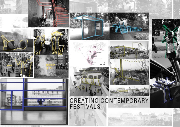
One of the difficulties we faced while working on these images were that they were very inconsistent in color, quality and size. So in order to make the images look consistent so that the illustration will read as one, the images were made black and white. This also helped in contrasting with the colors that highlighted the key elements on the images.
Fathmath Ihudha Amir
Edit/or – Editorial Team

You must be logged in to post a comment.