One of the key tasks for the Co.Lab module was to review the existing website for the Architecture, Festival & the City, and propose a new design template and content for a new website. As a group we analysed the current website and discussed pros and cons associated with it. We found the website was outdated in terms of its contents, and required a different design template to make the website more interactive to its audience. We discussed various requirements for the website with our Co.Lab module leader, Jemma, and managed to draft a map (figure 1) of how the website would run. The site map guided us to map the navigation sequence, and to categorize and organize the various key aspects of the website content.
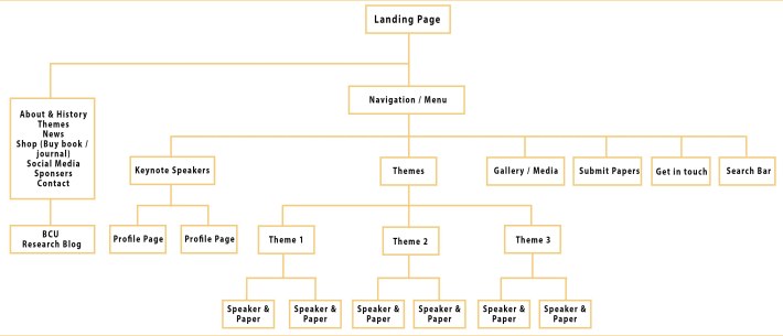
Figure 1 – Site map
In addition, we researched on different templates for websites and analysed a collection of website precedents to identify which ones are easier to navigate and interact with. We also looked into different design templates for the website and analysed color themes, fonts and layouts. Below are some templates we looked into.
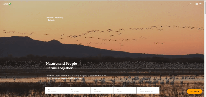
Figure 2 – Minimal style

Figure 3 – Clear navigation
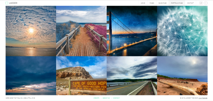
Figure 4 – Layout of visual content
Though we didn’t have prior knowledge in professional website making, we found this project as a good opportunity to utilize our previous experience in creating wordpress / WIX websites, and gain an insight into the next step of the process. Similar to the design work we do in other projects in the course, we established common interests in designing a website, where layout designs, fonts, typography and content editing can be explored and experimented further.
Fathmath Ihudha Amir
Edit/or – Editorial Team

You must be logged in to post a comment.