Introduction
- After the introduction of all the stories our group decided that we would like to pursue the colours project, this was due to the broad nature of colour, the way we perceive it and the history behind it. There are so many various ways in which we use it and has an effect on our psychological and emotional frame. Even looking at colour in a primitive or instinctual way through nature how we perceive red to be a colour of danger as an example; we also associate different colours with words as red is associated with the word “Danger” or “Power”.

First Impressions
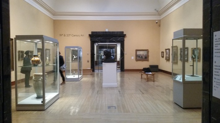
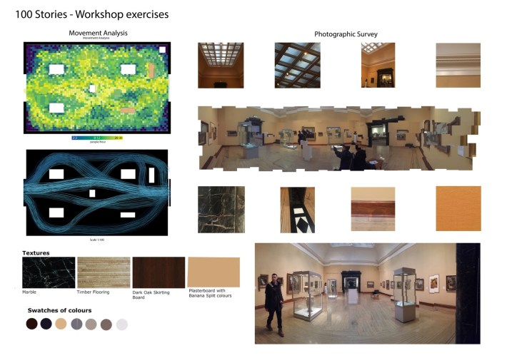
- After we chose our “Colours Story” we were given a tour around the museum where we were shown our gallery room. We analysed different aspects of the room such as the colours, access, current exhibition, galleries in context, circulation, lighting and atmosphere.
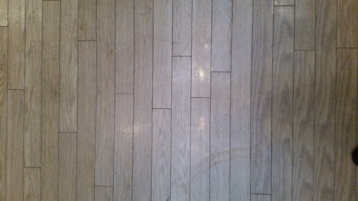
- There was one particular shade of colour used throughout the room, this was a pale yellow colour that had faded over time, this colour was used as a background tone that did not distract from the artwork on display.
- There are 2 main access point into the room, the entrance is a double door width marble framed entrance and the exit of the room is a double glass automated door that is activated via button with disabled access. The entrance and exit are located directly opposite each other allowing for clear direction through the room.
- The current exhibition in the room was composed by paintings that varied in colour and depth, light and dark. There was even a famous painting on display by Picasso. We found out from one of the Bmag colleagues that the position of the paintings change over a period of time.
- The circulation in the room is very simple with all four walls used as painting displays with 3 square pillar displays and 2 benches allocated in the room to allow people to sit on them.
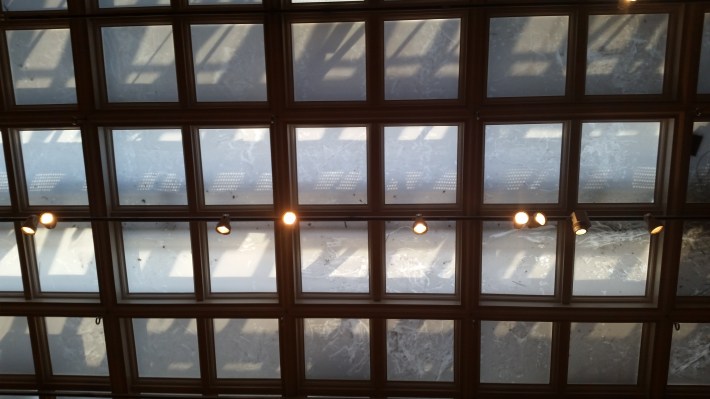
- The room is lit by artificial lighting and the roof lights are covered in a plastic film this is due to the nature of the paintings as they can be affected by direct daylight and cause the paint to fade.
- In conclusion we found the paintings in the room fascinating but the colour used in the room was rather dull and dimmed and did not do the artwork justice. With the nature of the circulation in the room and the way in which the entrance and exit were located it made it rather easy to pass straight though the room without being forced or even persuaded to look at the work, as soon as you enter you can see the exit; this observation shall be used as a key issue to be solved in our design.

You must be logged in to post a comment.