Isotype is a visual language that allows you to put across a narrative or a simple instruction in the easiest to understand format. It is not a replacement for text but an addition to it.
Rules –
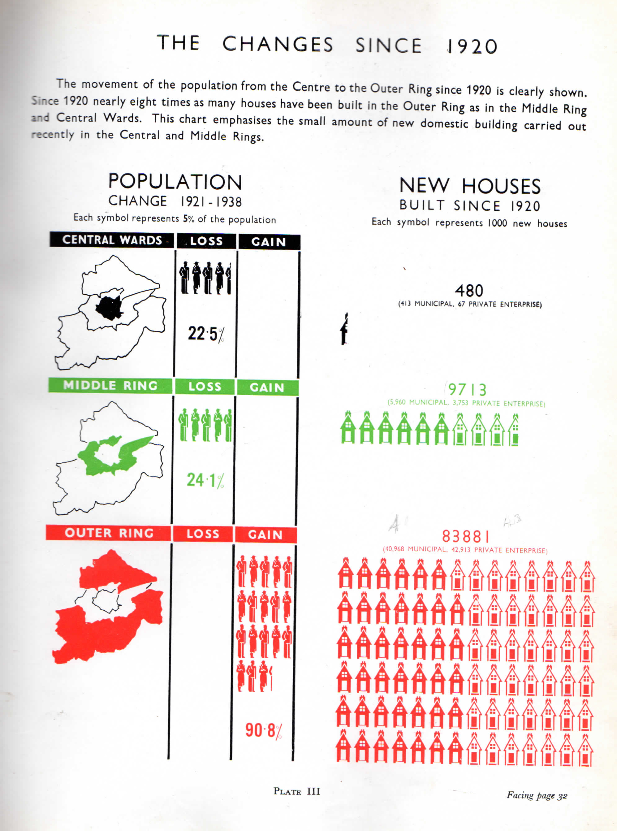
– Greater quantities are represented by a greater number of single sized pictograph and not enlarged versions – could be confused for comparing something other than amounts for example. This is provides a very simple comparison system to tell as story like the example above, but to actually use the data it becomes incredibly difficult to count the amounts of instances in large numbers.
– Perspective was seen as superfluous, by allowing the viewer to see the whole picture it puts them into a privileged position.
– A system of generic symbols could be modified to represent a different type of information – by taking a standard figure and modifying it. In ‘When We Build Again’ the standard man and woman become the ideal early 1900 figurines.
– Isotype used only seven colours; white, blue, green, yellow, red, brown and black. Red and black are the default colours when printing did not allow the range. Colours specific to each individual paradigm tell a story and get you to focus on specific areas, in the above example the massive gain in population is more important than the central/middle.

You must be logged in to post a comment.